As part of our role as interior designers we also address aspects of the exterior of a venue. There’s no point having a stunning interior if there are no customers to experience it, so the job of the exterior elements of a design is to pull people in and to clearly communicate what you are offering.
Our clients have usually done lots of work on the branding for their restaurant or cafe start-up, and as interior designers we have to incorporate these brand elements into our proposed designs. One of the major things we look at is signage. It’s one thing having a great logo and concept for your venue, but this needs to be displayed in the most effective way possible, and to tell people immediately what you do and why they should come inside.
To show you how we tackle signage here’s a case study on two sites we designed for Chozen Noodle. Serving Asian food, and specialising in hot noodles, rice dishes, udon and sushi, Chozen Noodle are mainly situated in roadside service stations. Our design for two of their new venues shows just how important signage is to the overall look and appeal of a restaurant.
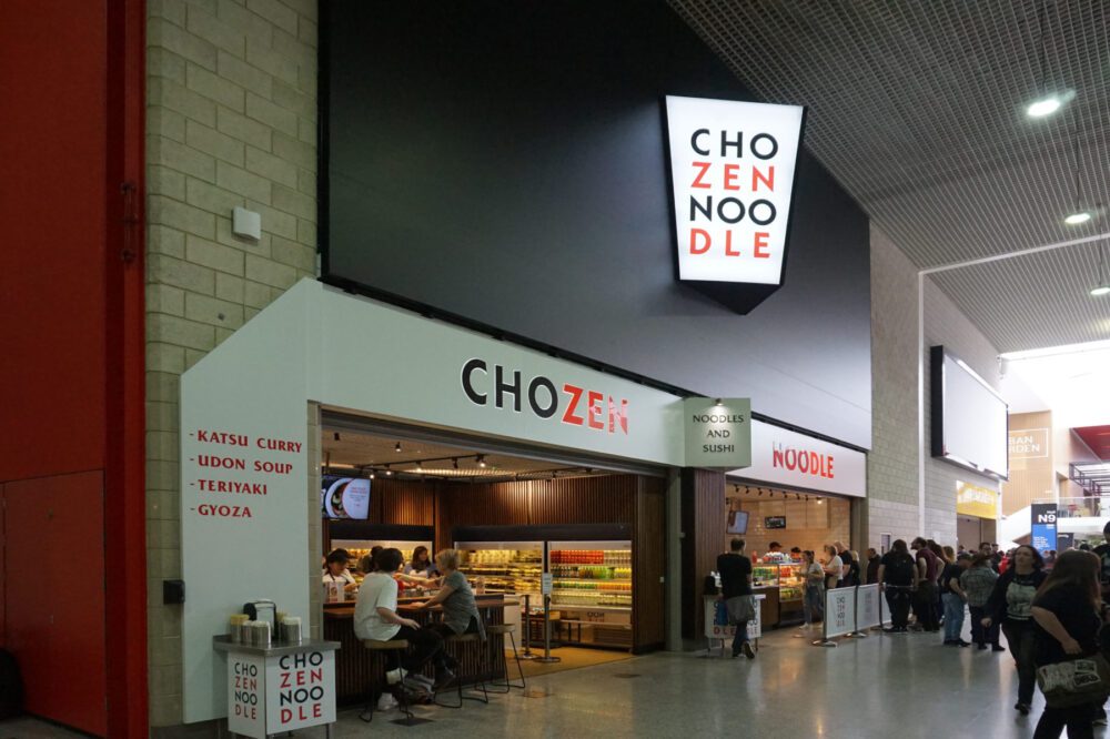
One site (shown above) is in the Excel Centre in London, an exhibition centre that draws huge and very diverse crowds for a range of events. Often people are visiting for the first time, so a retail or restaurant unit needs to immediately catch their eye and draw them in. To do this we used a large, high level, internally lit noodle box with Chozen’s branding. We also created lower level signage, inspired by the brand’s Asian roots, using an origami fold to drop from the fascia to the side.
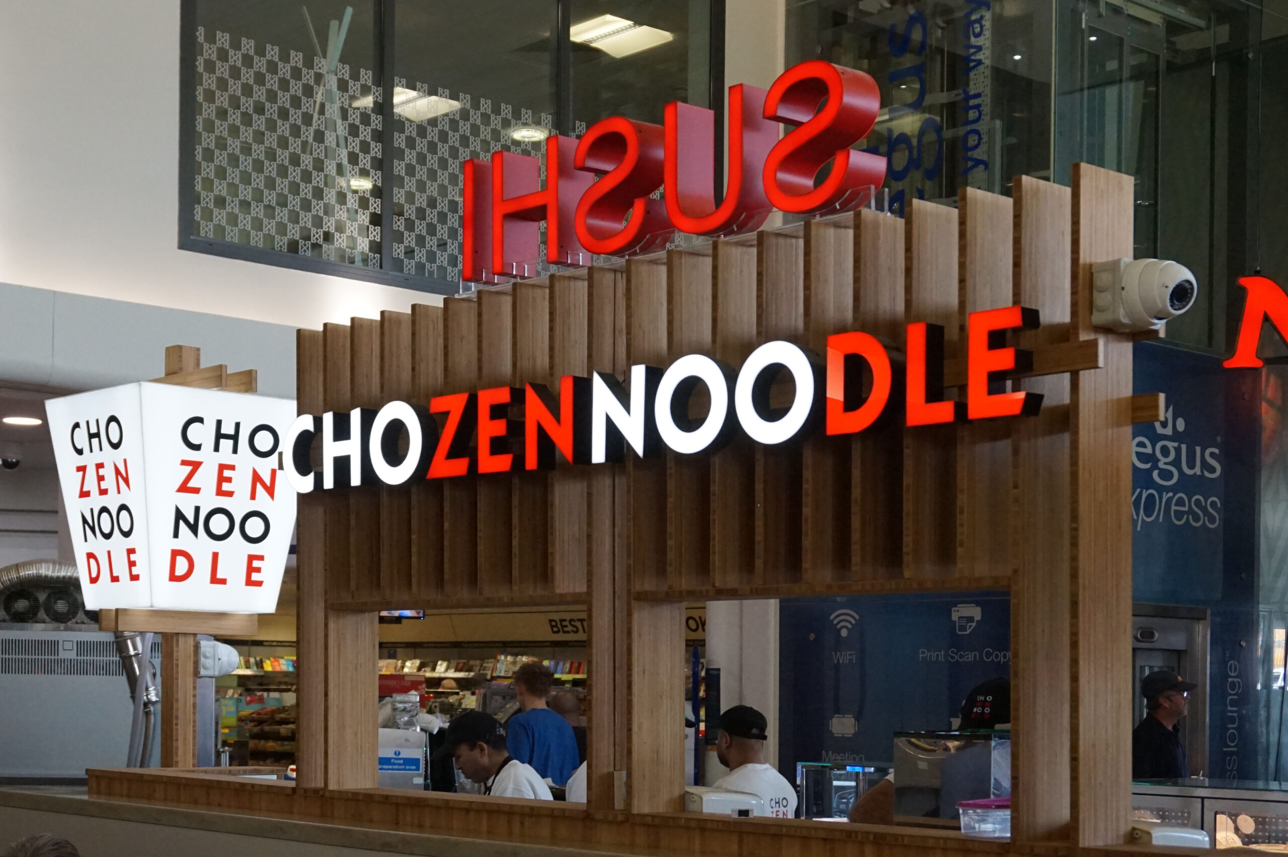
The other site had a specific requirement for the brief. It’s part of the Cobham service station and all retail units have to ensure they don’t completely block customers’ view of other units or the facilities. The large, origami-inspired signage wouldn’t fulfil this, so we came up with a nifty solution. To support the overhead menus and signage we used Japanese-style fins, which allow light and the eye to pass through. Keeping the large noodle box sign maintains continuity with the core branding.
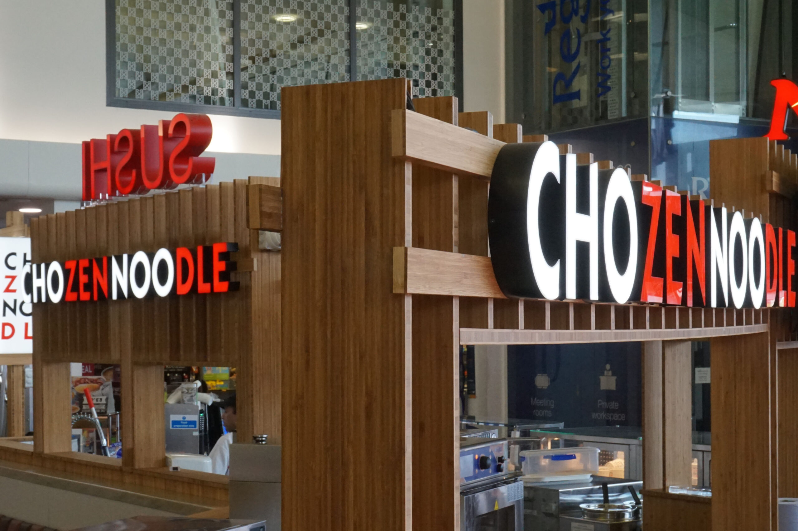
We created a space between the counters and signage to ensure transparency, and used bamboo and overlapping on those sections where horizontal and vertical elements join. This also ensured the brand’s Asian heritage was clearly represented and conveyed to customers.
As you can see, it’s perfectly possible to adapt a restaurant’s branding to suit the specific requirements of a certain space, while staying on-brand and true to the original message and design. The skill is in finding those core elements and working flexibly to continue them across all sites and signage.
For more on the benefits of great restaurant interior design and how to choose the right venue for your independent business go here or here.